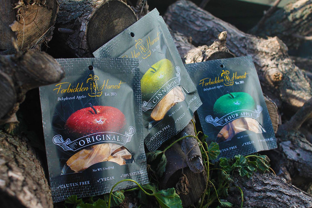
DESIGN RATIONALE
Forbidden Harvest, a company specializing in organic dehydrated apple chips, needed to present itself as high end, vintage, organic and sensual. The challenge was to create a theme, name, brand identity, and a package design system for three different varieties of the product.
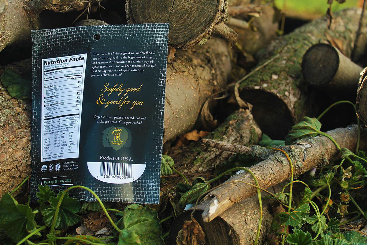
The dehydrated apple product is one that has been designed time and time again with all the health benefits in mind, but without a theme attached to it. It is based on the story of Adam and Eve and the forbidden fruit, which leads to the creation of sin. The brand is supported by organic, vintage imagery. The package features earthy typography and a burlap texture background to reinforce the organic component. The banners used to display the product variety (original, sour apple or cinnamon) are crafted from a vintage aesthetic. It shows its sensual side through the dewy apple imagery on the front of the package, apple logo, and the use of dark colors with bright accents. The coloration, black accented by gold, is also meant to evoke the idea of a quality product.